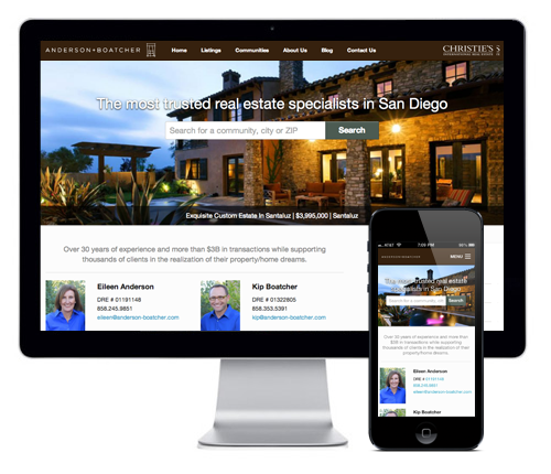
A+B Responsive Web Design
Complete redesign of the Anderson+Boatcher website, a leading real estate company located in San Diego.
Complete redesign of the Anderson+Boatcher website, a leading real estate company located in San Diego.
Anderson+Boatcher is a leading high-end real estate agency in San Diego. They wanted to increase traffic to their existing website and improve conversions.
I lead the research, creative and experience design and am responsible for wireframes, high-fidelity mockups and front-end development of the responsive web site.
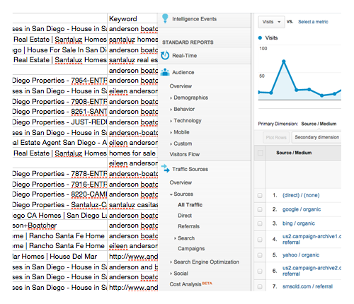
I began by learning as much as I could about their clientele. Meetings with Anderson+Boatcher revealed that a very large portion of their clients were repeat customers. Website analytics revealed the much of their traffic were repeat visitors.
I performed keyword research on terms that Anderson+Boatcher thought were most important for them to rank on the major search engines. Analysis revealed organic search results on key terms were actually fairly good. However, despite relevant content on Anderson+Boatcher’s site there was a very high bounce rate.
Further digging in analytics showed that nearly 50% of all Anderson+Boatcher website traffic is from mobile and tablet devices. The current website is not optimized for mobile and much of the content is Flash based and completely inaccessible by iOS devices. Visits from these devices accounted for a significant portion of bounces.
After reviewing the initial findings with Anderson+Boatcher we decided to define new goals for project. We would start from the ground up focusing on accessibility and optimizing the experience for mobile and tablet visitors. Once we had a site that was accessible and met the needs of current visitors we could focus on increasing traffic.
I created simple prototypes for the home and property detail pages (the two most popular landing pages). They were simple but built using responsive web design so the content would accessible to a larger number of visitors.
I performed A/B tests to a percentage of website visitors. We gathered test data and made small iterations to the test landing pages.
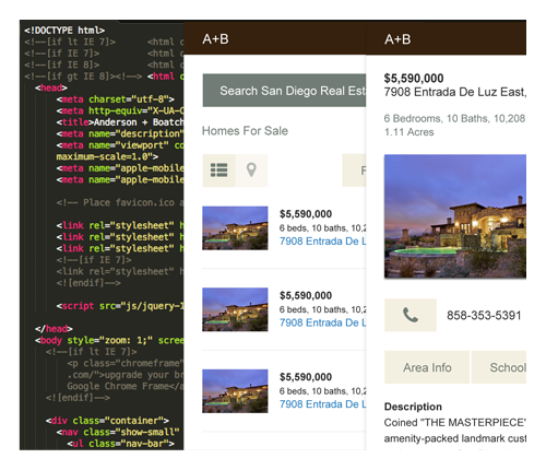
For the first step, we decided to target mobile and tablet visitors with a page that was optimized for those devices. The test page was presented to 50% of incoming traffic. Repeat visitors would see the same page on subsequent visits.
The first metric we wanted to look at was bounce rate. A significant amount of the site traffic is from mobile devices and much of that traffic was bouncing. The theory was that this could be due to a site that was not optimized for mobile devices. The data shows that visitors on iPhones and iPads were more successful on the test page with lower (iPhone 50% less) and (iPad 17% less) bounce than the control.
The other element we were testing was user success. The data showed that those who arrived on the test page continued deeper into the site and visited more pages. Users on iPhones that were delivered the test page visited 1,250% more pages than those arriving on the control. The test page also received 28% more return visitors than the control and a lower exit percentage.
Based upon initial user testing, we are building out a more complete responsive solution to test.