Click image for process and detail shots

StockTwits Mobile

With our new mobile application we set out to completely redesign the StockTwits mobile application experience.

Objectives

Overview

Analytics and research demonstrated our community’s growing need to access StockTwits from anywhere. With approximately 50% (and growing) of daily traffic consuming StockTwits via mobile and tablet we decided to dedicate the team’s energy and assets to creating a mobile application that met the community's demand.

My Role

I lead the creative and experience design and was responsible for everything from wireframes and prototypes to final front-end development. As part of a three person product team, I also contributed heavily to research, project requirements, software testing and user testing.


Building StockTwits Mobile 2.0

Our previous efforts creating mobile applications had mixed results. We had focused on creating an application that would more or less mimic the features found on competitors applications. This was a flawed strategy from the beginning. It meant designing to compete on a feature level rather than overall experience. It meant not focusing on what we do best and what our users really wanted from us on mobile - a sentiment that was quickly expressed upon release.

This time we were user focused. We chose a lean ux approach. Our team had recently been considerabley downsized an we really wanted to emphasize collaboration amongst the remaing small team. We knew there was much we could learn not just from our users but also our engineers, support team and community team. We also wanted everyone to feel a sense of ownership over the product. I think this proved to be a very successful strategy.

Reaching Out

First, we gathered and synthisized feedback from our exisitng mobile offerings. Next, we reached out to our most active users via the StockTwits platform and gathered volunteers for interviews and testing. We conducted interviews to identify pain points, needs and use cases. We also encouraged continued input during all phases of design.

Data Week

We kicked off our new team wide with a “data week”. Everyone on the team from product, engineering to community and support were encouraged to perform user research to learn as much as they could and then present it to the team. Each team leveraged specific skill sets and access to specific data to perform research. This returned some interesting, unexpected and extremely valuable data about our users and their behavior.

Personas, Context

Our in-depth research helped us better understand the varying use cases of the platform by different users. We utilized personas to help better define our users and their requirements. We conducted research with users that fit our persona hypothesis to gain insight and establish specific requirements. Personas helped us when making design decisions as well as creating empathy within the team.

Sketching
InVision Prototypes
Interviews

Design

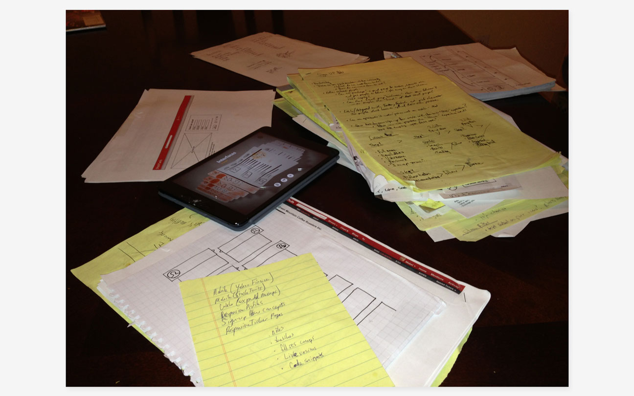
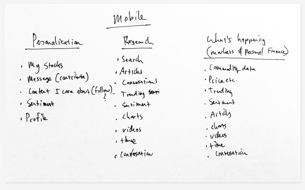
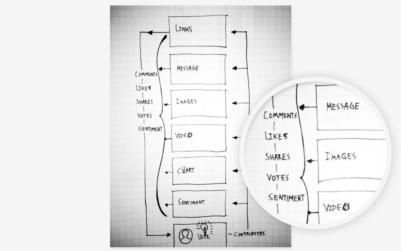
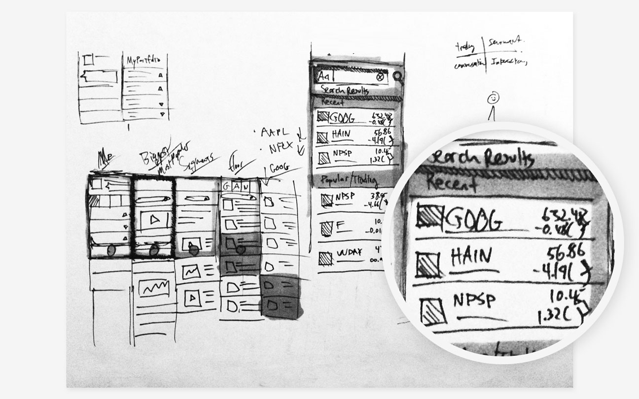
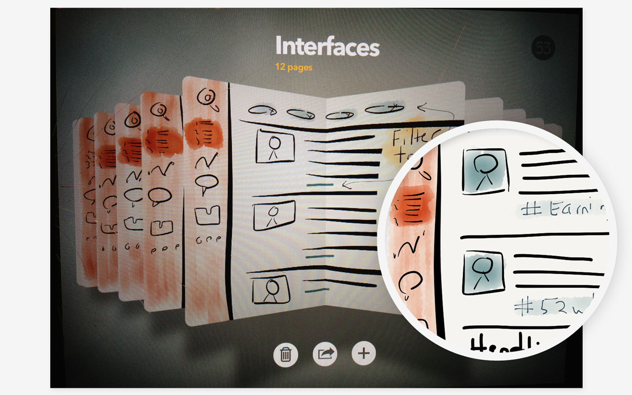
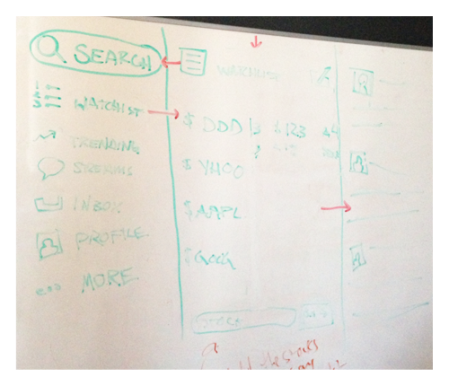
After our focused research we had the necessary knowledge and tools to begin designing our mobile experience. We began our user-focused design with sketching. We utilized sketching (hand sketching, whiteboard, Paper on iPad) extensively for ideation, arranging UI and storyboarding.

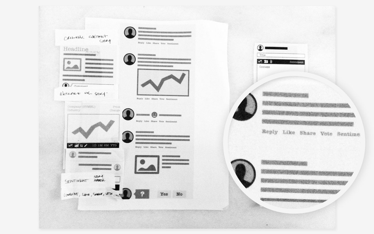
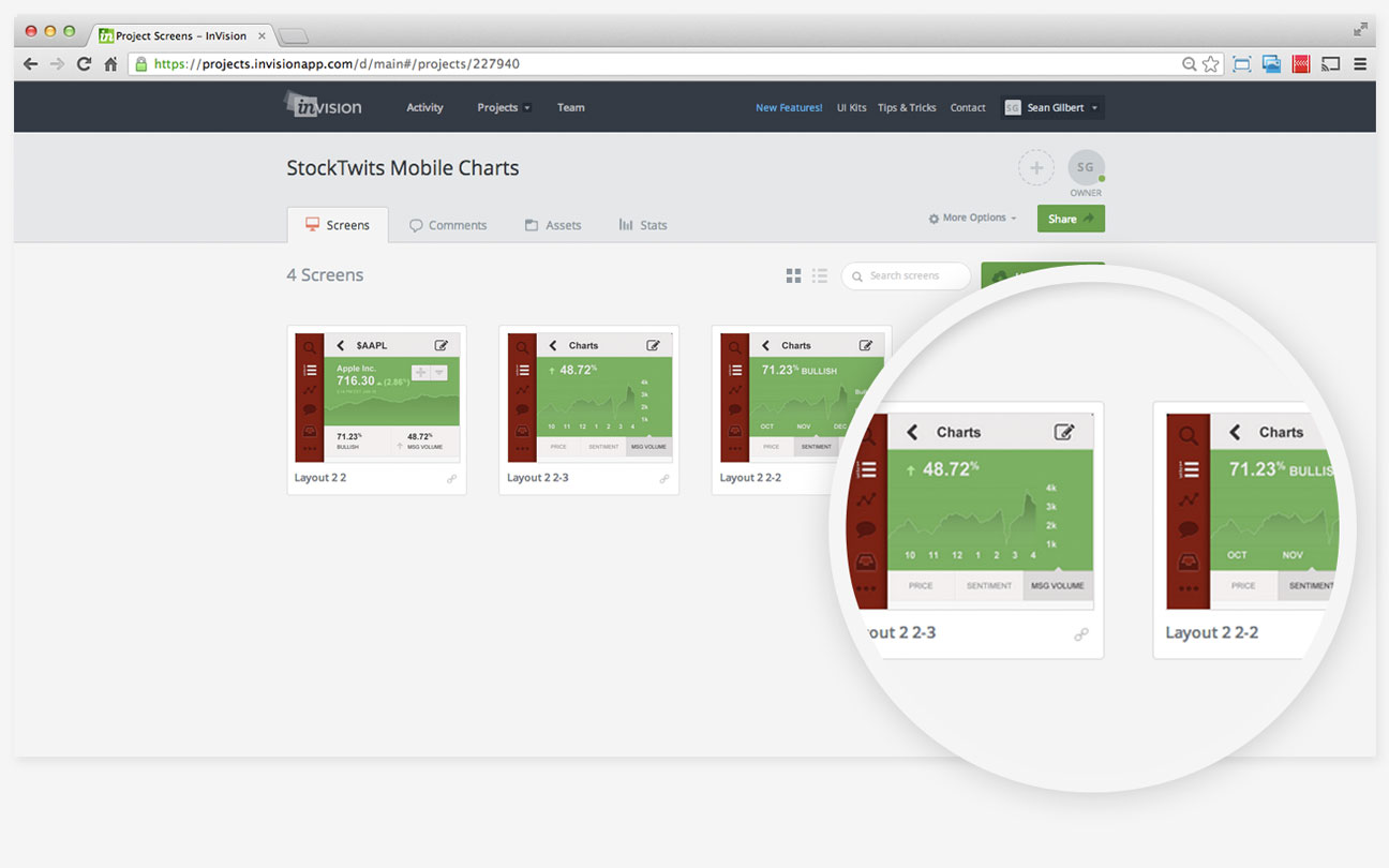
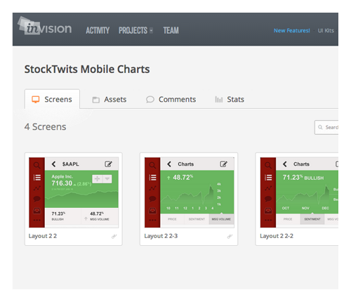
Next we created wireframes to refine the sketches and structure the experience. After validating internally, we constructed more detailed, interactive prototypes with InVision. We found that InVision was suitable for some internal validation but was limited for user testing purposes. At the time, InVision lacked simulated transitions. We created more accurate prototypes with tools such as FluidUI and Proto.io. Transition features allowed us to test the interaction design more thoroughly.

We tested our prototypes with users throughout the design process. Constructing small prototypes allowed us to test and refine designs both internally from an engineering perspective and externally with end users.

We maintained many of the iOS design and usability conventions where appropriate and leveraged more ubiquitous patterns where necessary. Differences between iOS and Android standards dictated that we employ patterns that were seamless on either platform while maintaining usability.

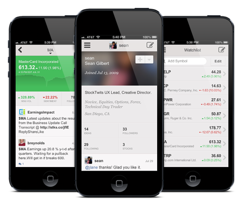
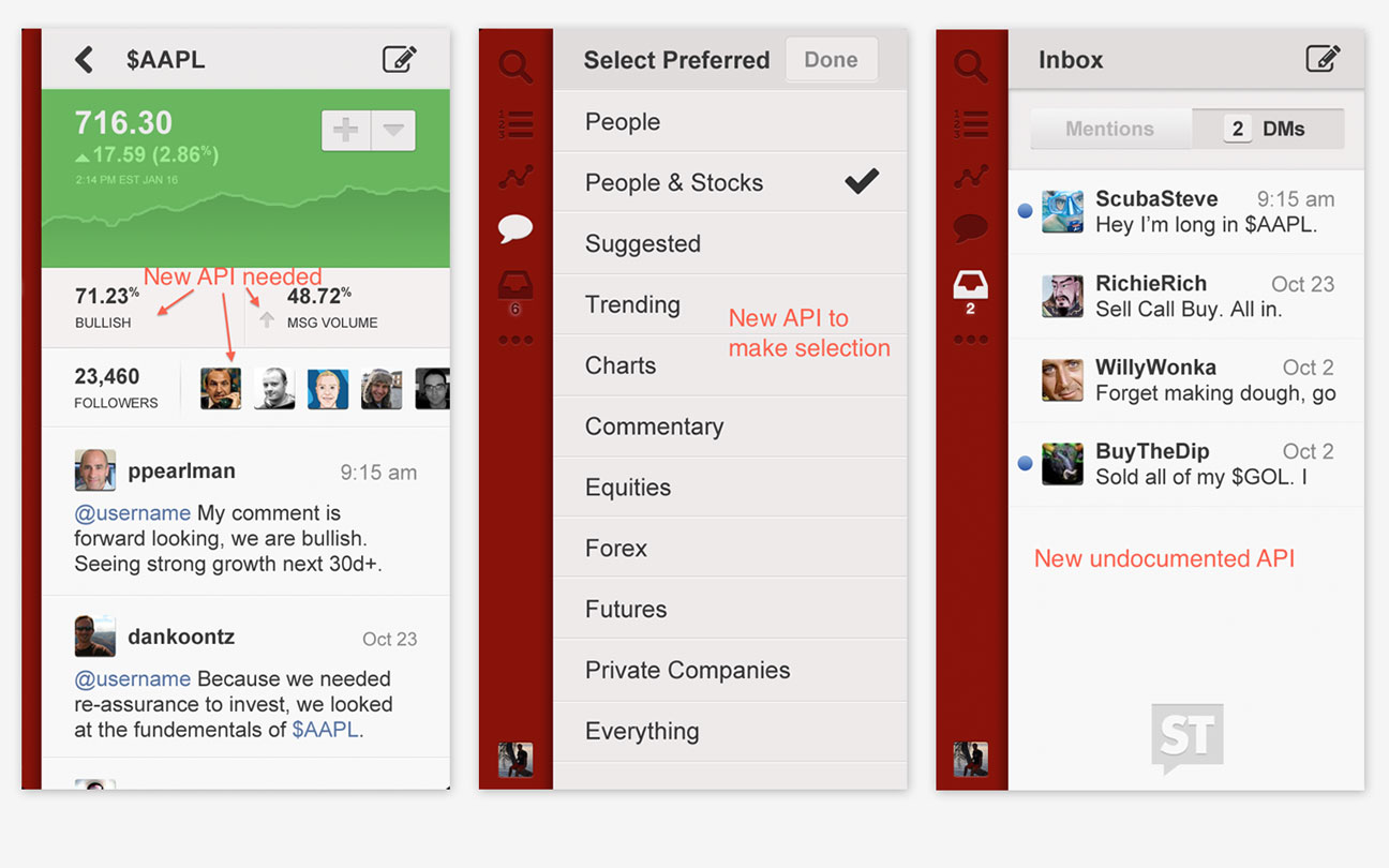
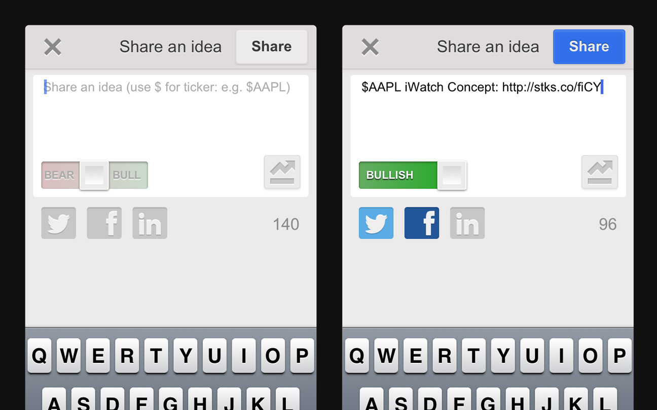
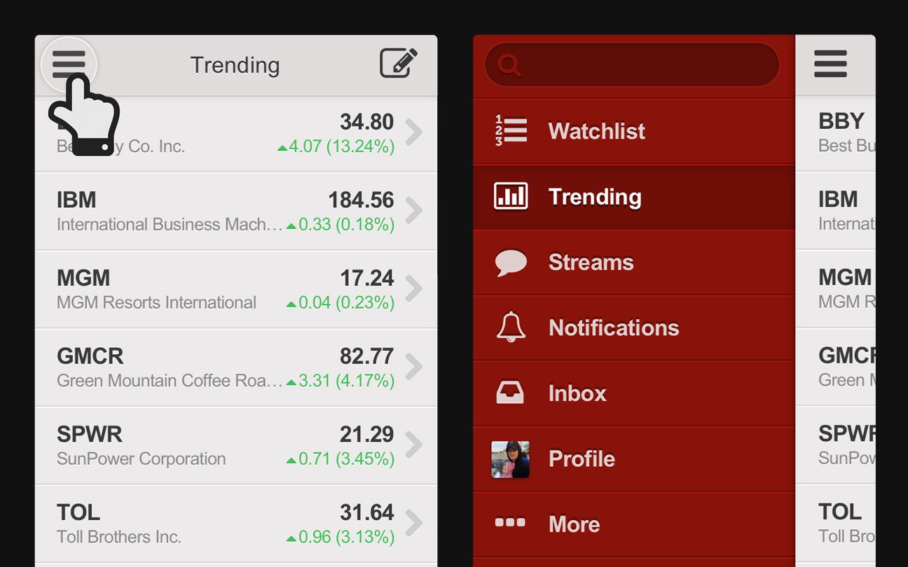
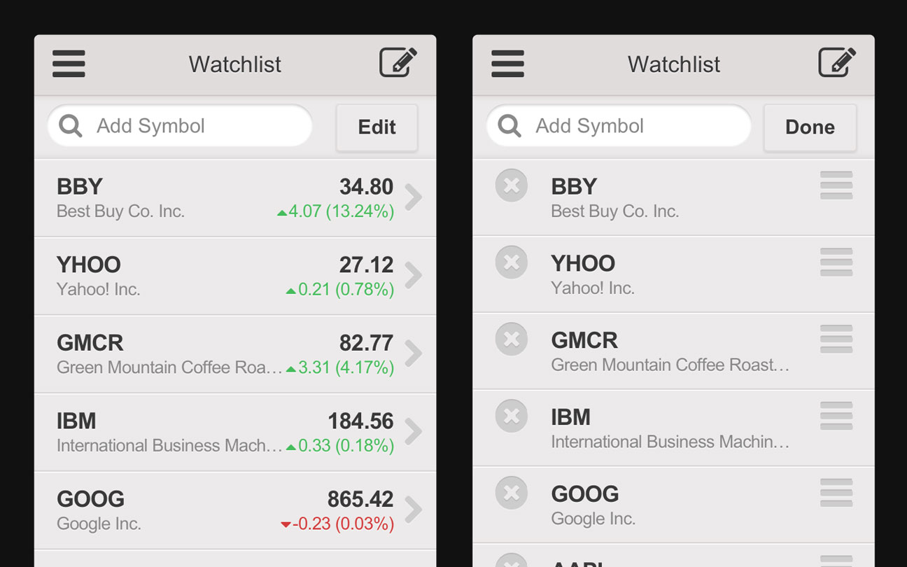
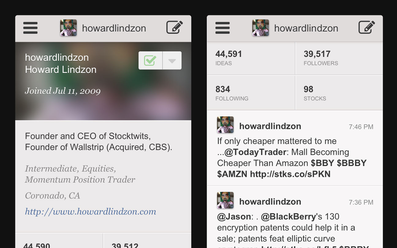
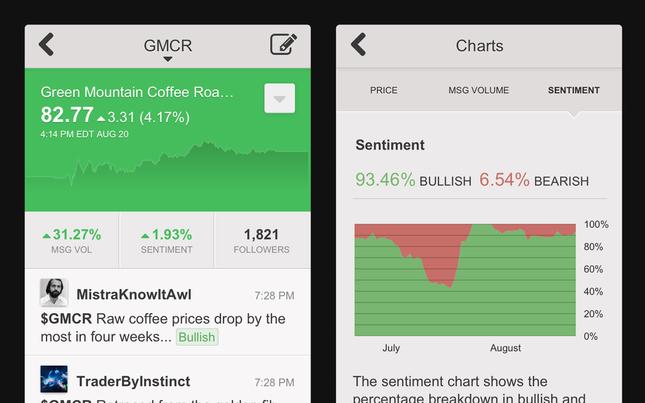
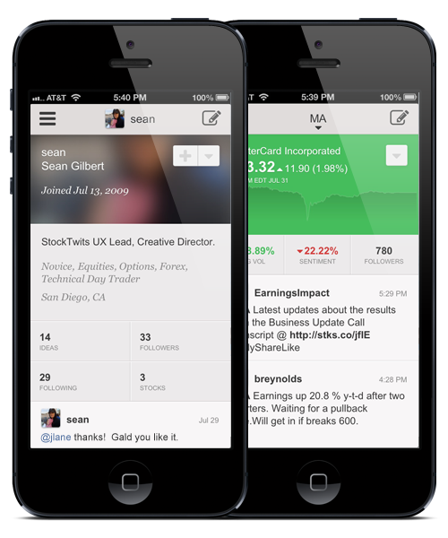
Real-time is a pillar of the StockTwits experience. We wanted the app to be fast. The aesthetic is light and unobtrusive so the data comes to the forefront. We created large target areas for primary actions and large fonts for readability. We wanted users to be able to scan views quickly and navigate with ease.

We designed a simple color palette to help reinforce usability. The scheme assigns consistent color and treatment to actionable items with specific treatments for active items that require action. Colors help users identify stocks that are on an upward or downward trend and where message volume or sentiment are on the rise and fall. Everything is designed for users checking in quickly on the go.

Mobile Design

Technology

We decided it was important to utilized the resources we had available in-house to develop our new mobile product offering. Our first attempts at mobile were built as native applications. We contracted the engineering because we did not have in-house mobile developers.

Working with contractors proved to be difficult. There was a great deal of unnecessary back and forth via email and phone to try to get the experience and features the way we designed. After the initial release we found iterating to be just as difficult, time consuming and ultimately more costly than we would have liked.

Recently there has been significant headway with tools dedicated to building native mobile applications using HTML and Javascript. The HTML and Javascript route was appealing because it would allow us to utilize our in-house engineering team. Ultimatley we decided to use Trigger.io. Trigger.io provided access to native UI elements, gave us complete control over testing, scheduling and release as well as allowing us to iterate without resubmitting the application to the app store.

Trigger.io

Alpha Testing

  • Deployed to iPhone and Android devices
  • 100 users are testing
What Our Users Are Saying

“I installed your app. Very impressive work... I can see myself using the app, seriously useful. “

-Zviki (Alpha Tester Feedback)

“Love it! Really like the UX. very clean and most important it's fast.“