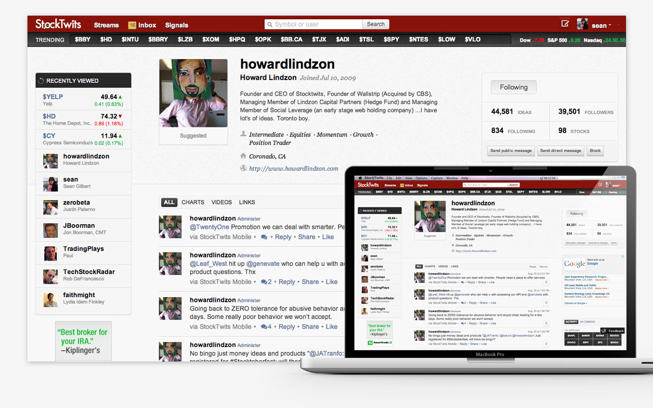
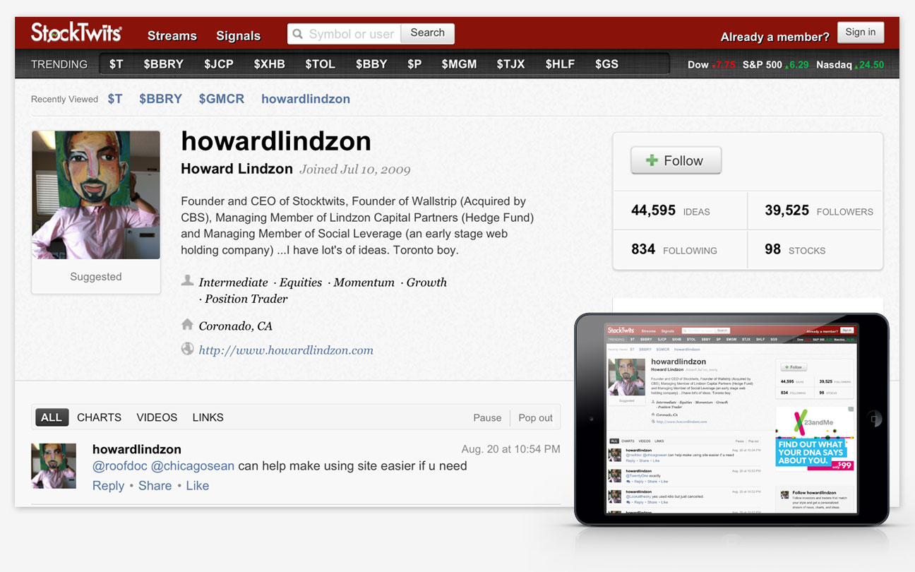
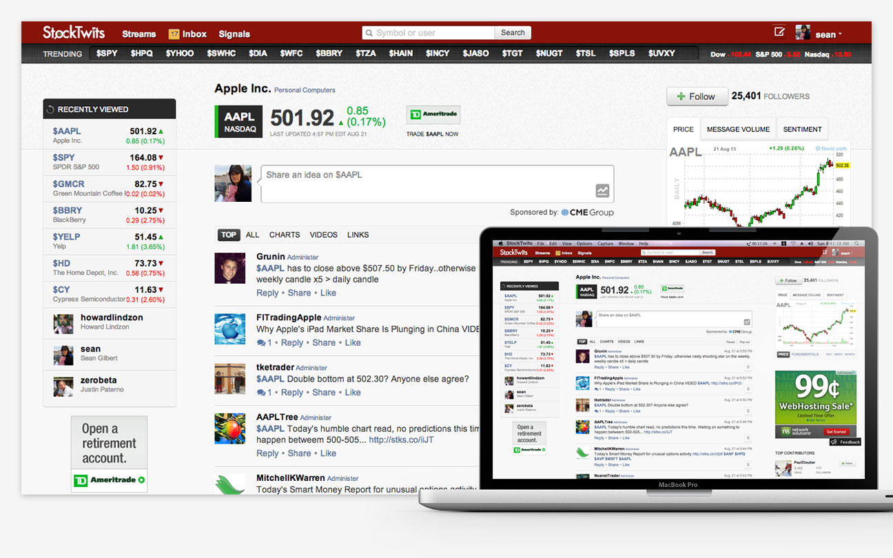
StockTwits Responsive Web Design
The StockTwits product team and I constantly tested and iterated to improve the product experience. One of the key updates was to unify the experience across platform by implementing a responsive design.


The StockTwits product team and I constantly tested and iterated to improve the product experience. One of the key updates was to unify the experience across platform by implementing a responsive design.
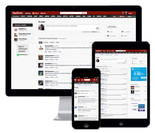
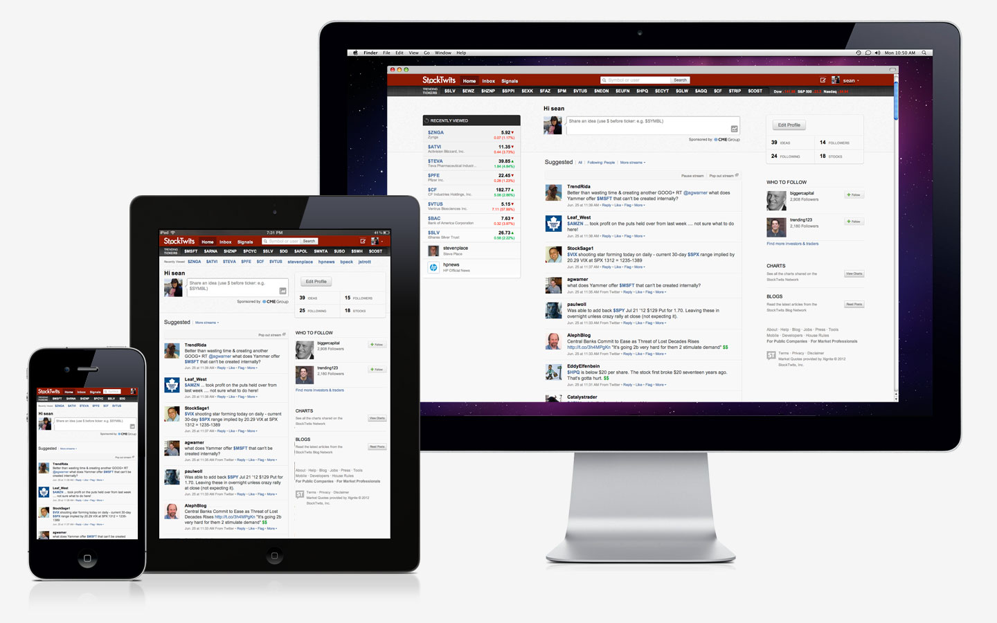
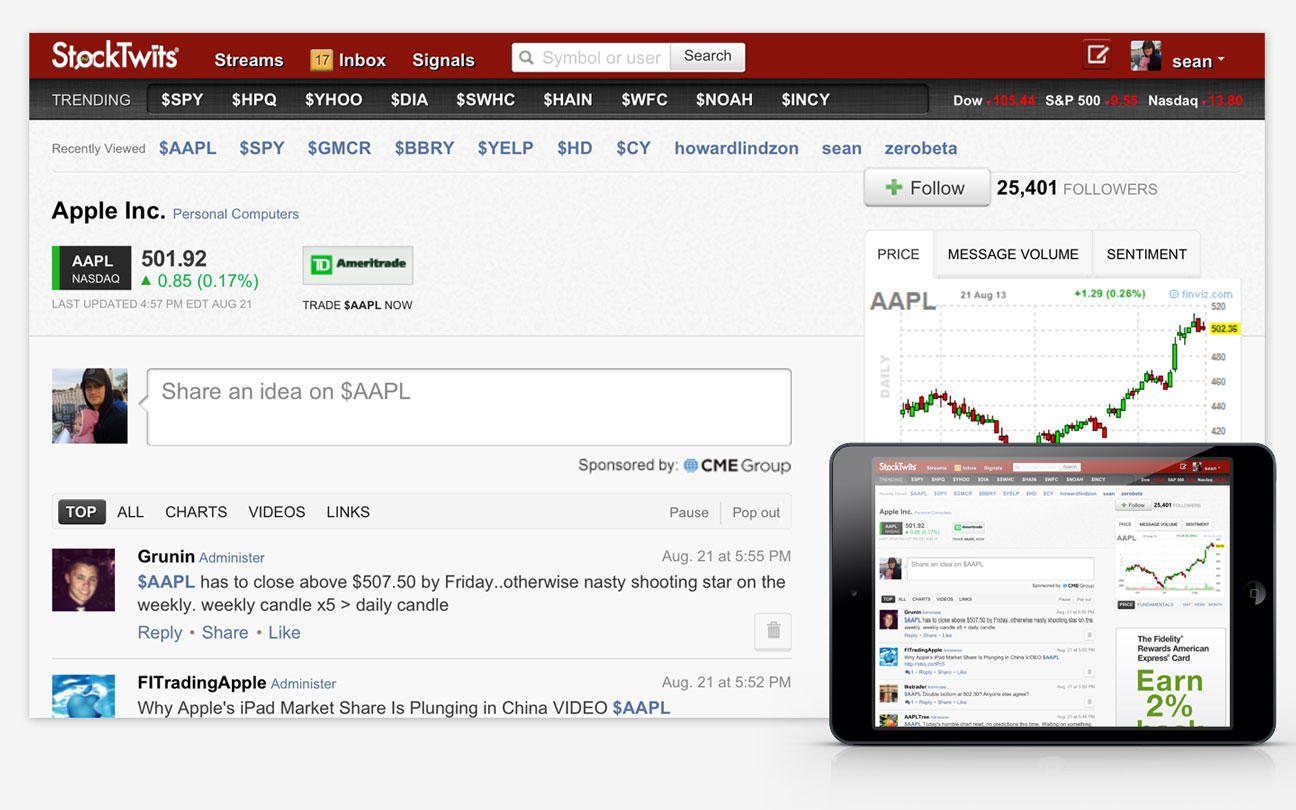
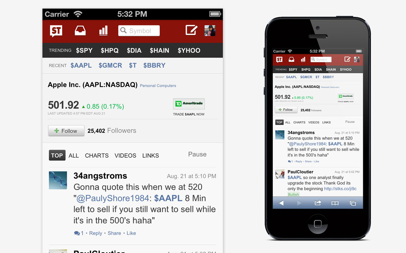
User feedback and analytics revealed a dramatic increase in demand for the full StockTwits experience on mobile platforms. We knew we wanted to create a future-friendly solution. With limited resources and growing demand we decided to proceed with a responsive solution for our web application.
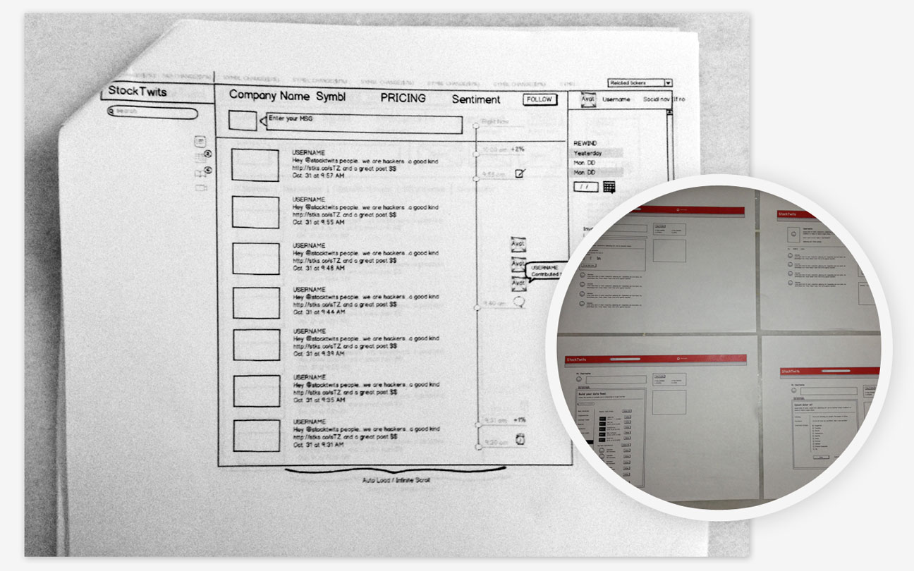
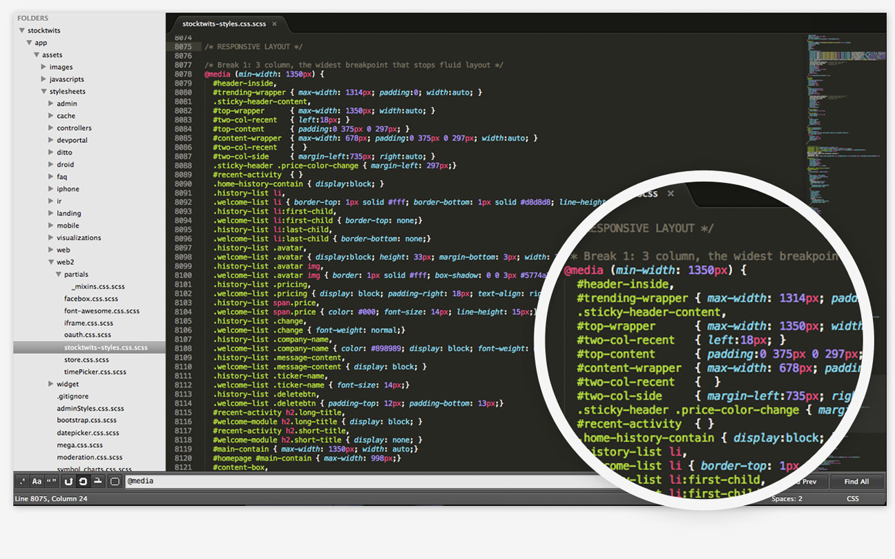
I lead the creative and experience design and was responsible for wireframes, high-fidelity mockups and prototypes. After the initial implementation our front-end developer left the company and I shared responsibility with another team member for all future iterations and front-end code.
We decided to implement a responsive design after evaluating site analytics and user feedback. Our exisitng native application was a simplified version of the full StockTwits web application. Users continually asked for a full-featured mobile version of the application. We also noticed that traffic to our web application on mobile devices had increased significantly - accounting for nearly 50% of visits.
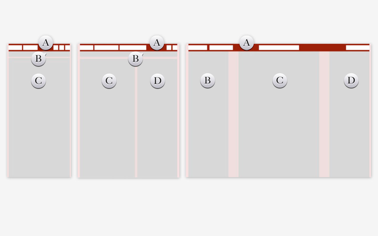
We developed simple static mockups of what a responsive page on a mobile device might look like. We utilized services such as InVision to create quick prototypes and tested with current users. We iterated based upon user feedback.
The responsive solution was a success. Users were very pleased with the full-featured experience across devices and StockTwits saw significant community growth in the year following the rollout.
“Vastly improved user experience on the iPad this morning, I love it.“